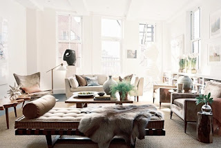
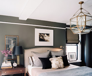
Beige is a bad word in interior design circles, a shortcut to describe a room that�s one-dimensional, dull, unimaginative, and not a lot of fun. But there is nothing wrong with beige, white, gray, brown, or any other neutral as the basis for designing a room. Assembled with care and finesse, a neutral room can create a serene but richly textured background for a colorful life. Here are our top tips for designing a neutral space that isn�t boring.
Remember Your Geometry
When designing a neutral room, make a conscious effort to incorporate as many different shapes as possible. Mix the straight lines of square picture frames and rectangular tables with an octagonal mirror, an oval rug, a round light and more organic shapes to create a graphic look that won�t overpower due to its neutral base. Painting flea market finds from various eras in shades of white will neutralize their differences, but make sure you look for a variety of shapes to keep the ensemble interesting.
Let There Be More Than Overhead Lighting


No comments:
Post a Comment